
The same paint colour can look warm and inviting in one room and cold and grey in another. The difference is almost always light — specifically, which direction the room faces and how much natural light it gets throughout the day. Toronto's light has particular qualities, especially in winter, that make this more pronounced than homeowners expect.
Get a free written quote — no site visit needed.
Send photos of your space and Reza will send a line-by-line estimate within 24 hours. Serves Toronto and the GTA.
Start your free quote →Why Toronto light is different
Toronto sits at roughly 43.7°N latitude. In December, the sun rises low in the southeast and sets low in the southwest — it never gets high in the sky. That means even south-facing rooms in midwinter get indirect, raking light rather than the direct overhead light of summer. North-facing rooms may go entire winter days with no direct sun at all.
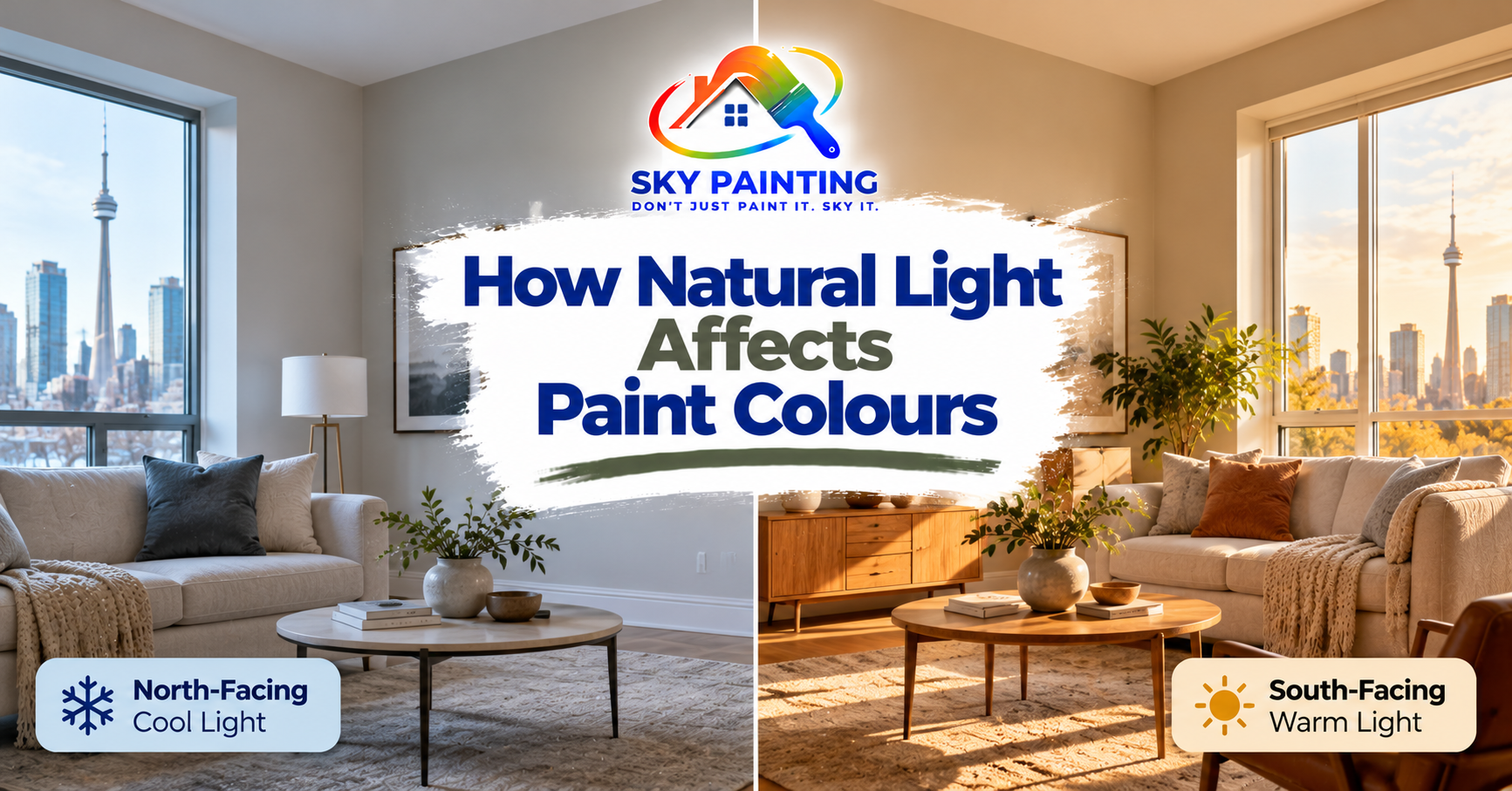
This matters for paint colour because light colour temperature changes with direction and season. North-facing light is consistently cool and bluish. South-facing afternoon light is warm and golden. East and west face different warmth levels at different times of day.
North-facing rooms
The most common paint mistake in Toronto homes. A homeowner chooses a beautiful warm grey from a paint chip at the store, puts it on the north-facing living room wall, and ends up with something that reads as blue-grey or almost purple in winter light.
North-facing rooms need colours with warm undertones to compensate.
- Best choices: warm whites (BM White Dove OC-17, SW Alabaster SW 7008), greige (BM Pale Oak OC-20, SW Accessible Beige SW 7036), soft terracotta or blush tones
- Avoid: cool greys (SW Repose Gray, BM Revere Pewter), whites with blue or green undertones (Chantilly Lace is borderline — it can work but test first), true whites without any warmth
If you love the look of a mid-tone grey, choose one with a warmer undertone — beige-grey rather than blue-grey. BM Collingwood OC-28 or SW Anew Gray SW 7030 work better in north-facing rooms than the more popular cool greys.
South-facing rooms
South-facing rooms get the most direct sun, especially in summer afternoons. The light warms and yellows as the day progresses. These rooms can handle cooler paint tones because the warm light balances them out.
- Best choices: cool whites, light grey-blues, sage greens, classic neutrals — these all work because warm light shifts them toward readable
- Watch out for: very warm colours (deep terracotta, golden yellows) — in strong south-facing afternoon sun they can feel overwhelming
East-facing rooms
East-facing rooms get bright morning sun that is warm and golden, then become cooler and more neutral through the afternoon. They are the most forgiving of the four directions — colours read well in both the morning warmth and the neutral midday light.
Most neutrals work in east-facing rooms. It is a good direction for testing a colour before committing to it throughout the house.
West-facing rooms
West-facing rooms are the opposite of east-facing: cool blue light in the morning, intense warm golden light in the late afternoon. The evening light in a west-facing room can be dramatic and beautiful, but it also means colours shift significantly across the day.
- Best choices: colours that look good in both warm and cool light — warm neutrals, soft blues (the evening light warms them beautifully), sage green
- Be careful with: bright yellows and oranges — they can become very intense in west-facing afternoon and evening light
Quick reference: light direction guide
| Direction | Light quality | Works well | Avoid |
|---|---|---|---|
| North | Cool, bluish, consistent | Warm whites, greige, soft terracotta | Cool greys, blue-toned whites |
| South | Warm, direct (summer), raking (winter) | Cool whites, grey-blues, sage green | Very warm or saturated colours |
| East | Warm morning, neutral midday | Most neutrals; very versatile | Very dark colours (morning glare) |
| West | Cool morning, warm/golden evening | Warm neutrals, soft blues, sage | Bright yellows and oranges |
Always test on the wall
The most important rule: test paint colours in your actual space, on the actual wall, before committing to a full room. Buy a large sample and paint a 30x60cm patch — big enough to see the colour in context. Check it morning, afternoon, evening, and under artificial light. What looks perfect at noon can shift dramatically at 6pm.
If you are working with a painter on a full-home project, Reza can advise on colour direction as part of the quoting process. Submit a free online quote request with photos of your space and note which directions the windows face. We work across Toronto and the GTA.